
Tutorials / Going further
Updated
Make Lumit yours
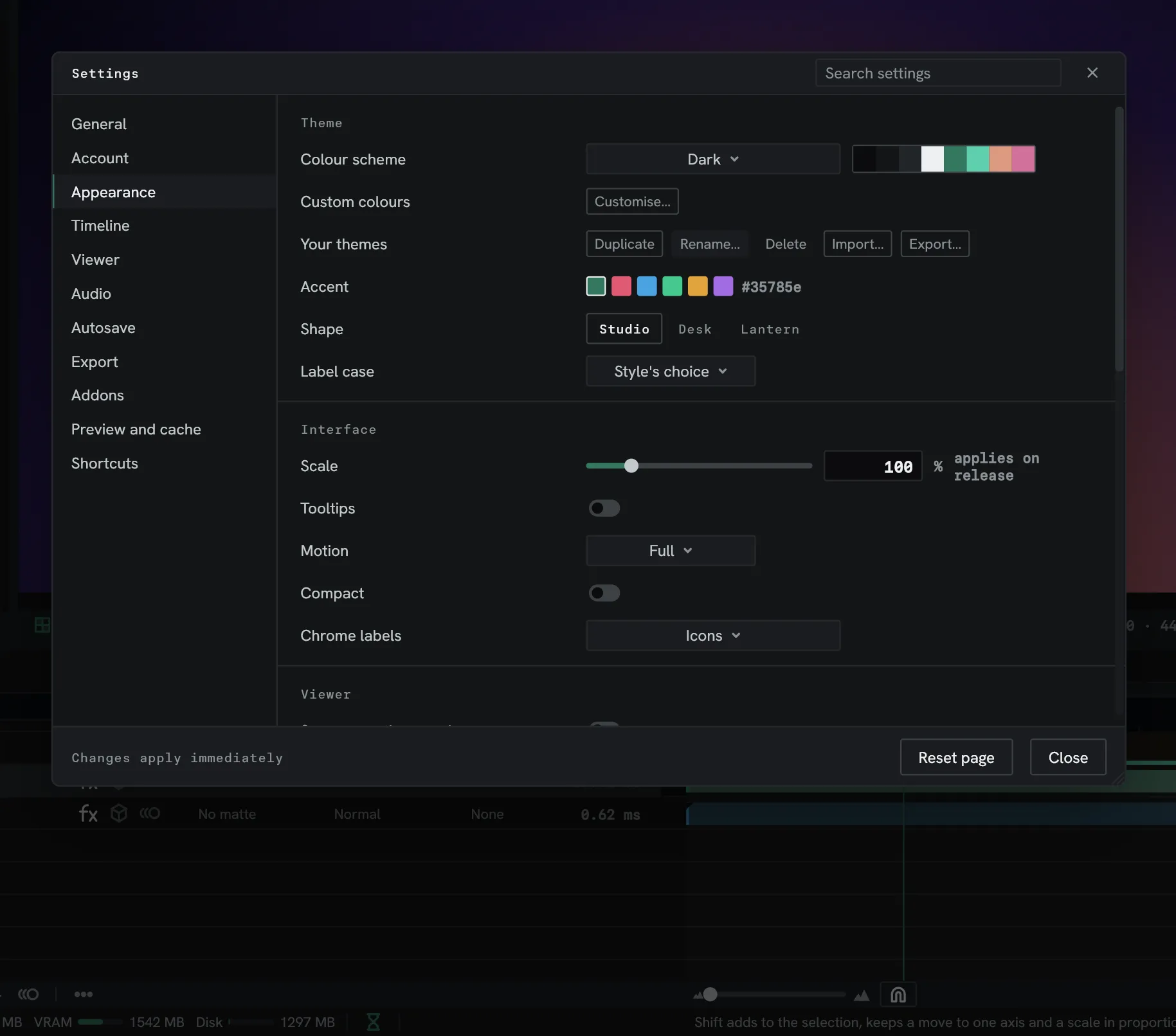
Lumit doesn’t have to look the way it shipped. Most of this page lives in Edit ▸ Settings… ▸ Appearance, and every change lands the moment you make it.
Pick a colour scheme
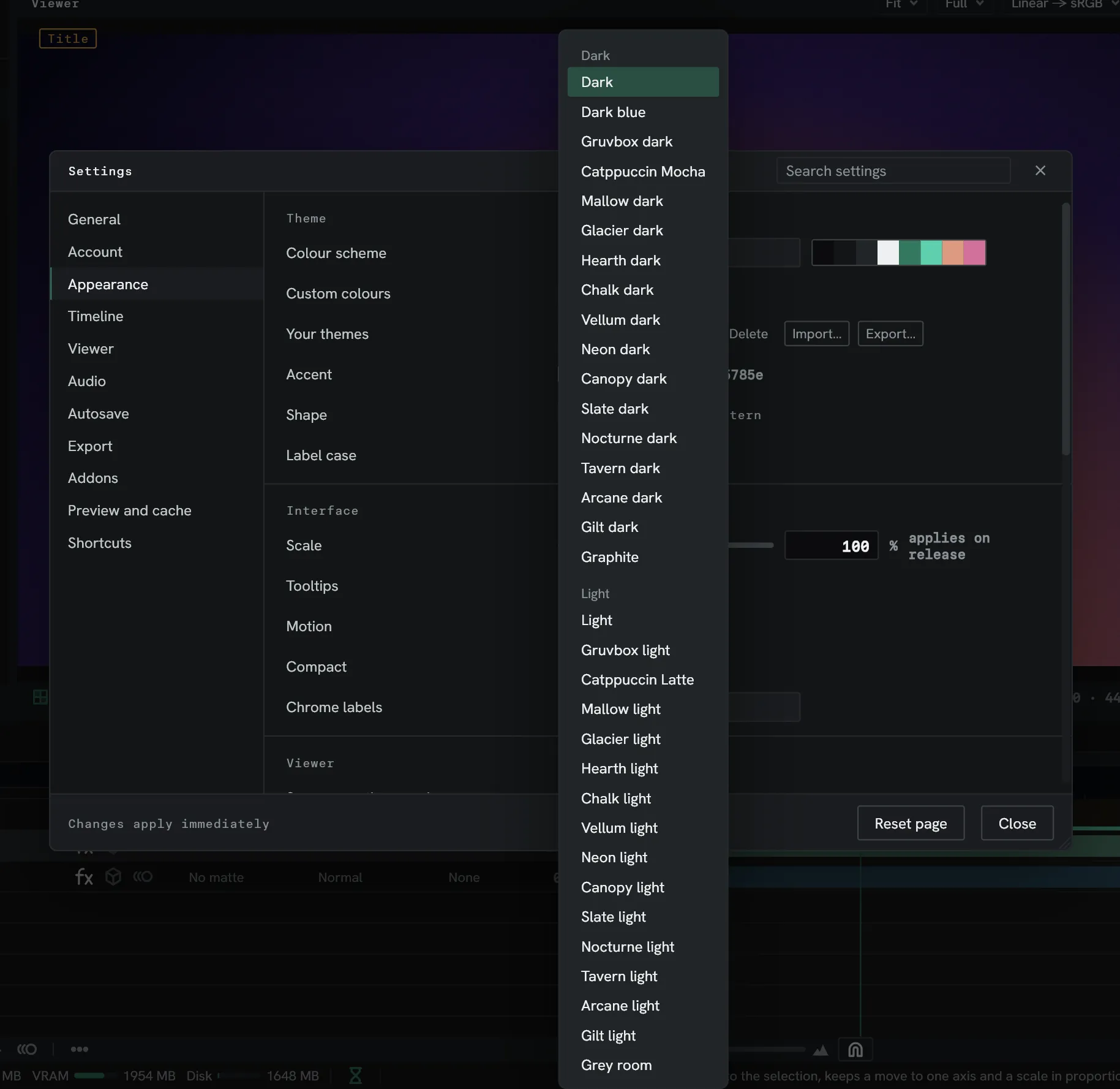
Section titled “Pick a colour scheme”Colour scheme has 33 built in, dark ones first and light ones under them. Point at one in the list and the whole window tries it on before you pick it.
Change the accent
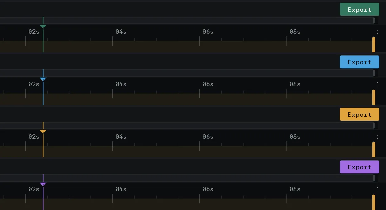
Section titled “Change the accent”Accent is the colour that marks what’s active: the playhead, the Export button, the tool in hand. Six swatches sit beside it, and pointing at one previews it.
Make a theme of your own
Section titled “Make a theme of your own”Customise… opens the theme editor on the theme in use. Every colour in the interface has a row, and the app repaints as you change one.
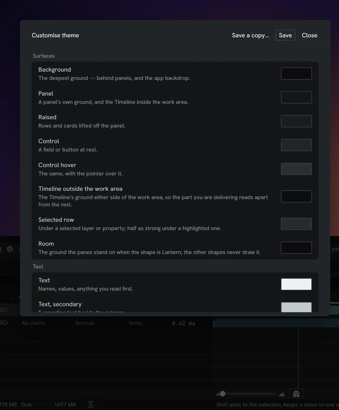
Save keeps it under Your themes. Saving from a built-in scheme asks for a name and makes a new theme, and Save a copy… writes the edits under a new name. Closing with unsaved edits asks whether to keep them.
Your themes also duplicates, renames, deletes, exports and imports them. A theme
travels as a .lumtheme file, so one can be passed to a friend. It’s written like CSS, so
one can be made by hand too: see Make a theme.
The Viewer’s surround is not in the editor. It stays neutral unless a theme file sets it.
Choose a style
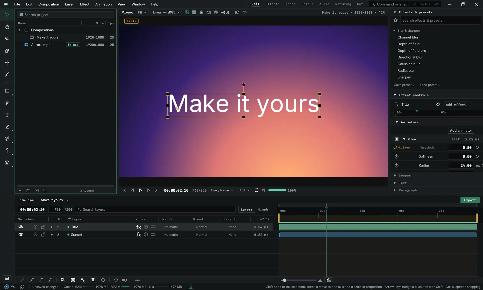
Section titled “Choose a style”Shape changes how the interface is built, not only its colours. It lists the three built in, then any styles of your own.
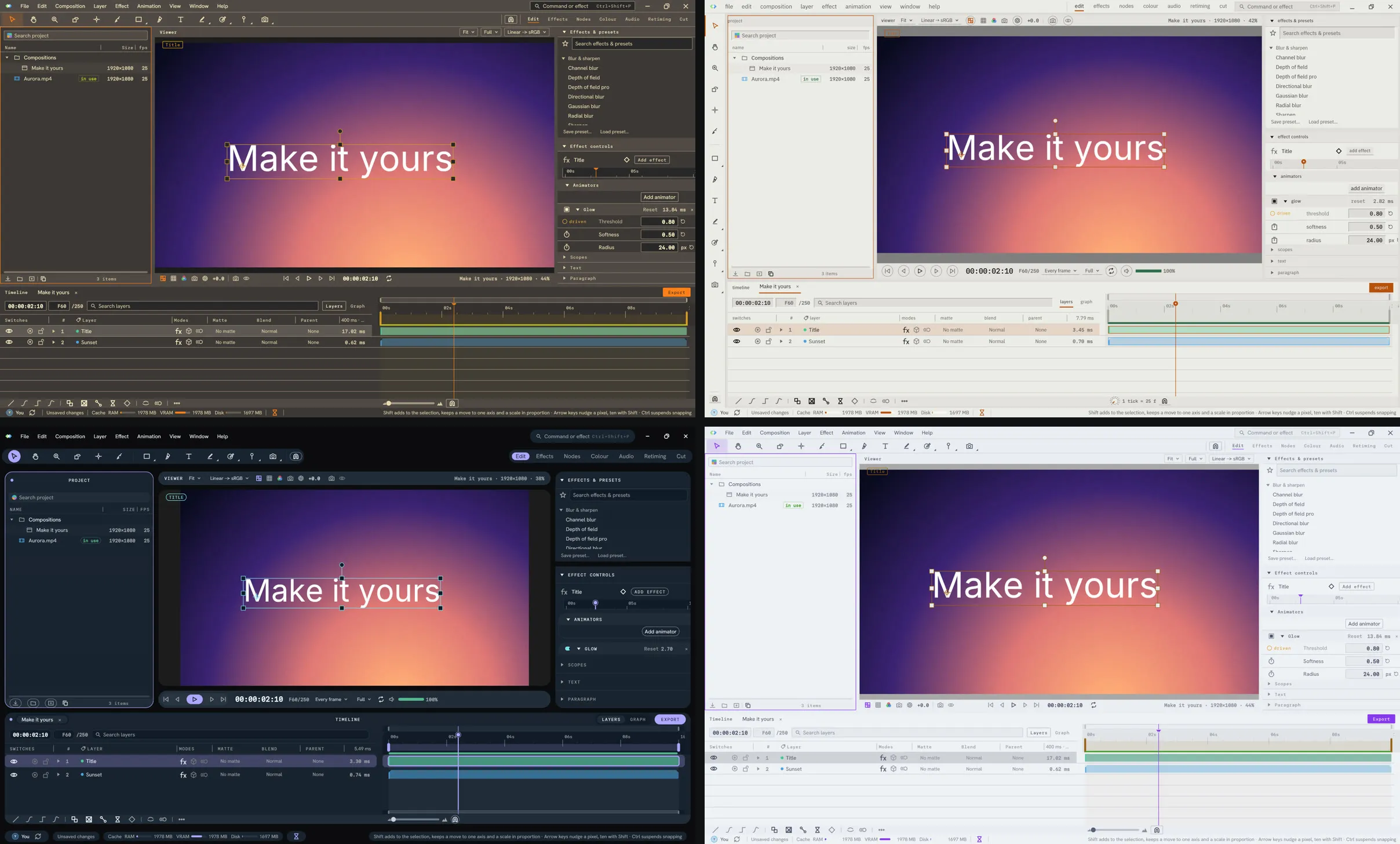
- Studio is the default: panels meeting flush, with hairlines between them.
- Desk is the same flush panels on a tighter grid, with lower-case labels and the toolbar down the left.
- Lantern stands each panel in a room as a card, with a gap and a shadow round it. Room sets it to Day or Night.
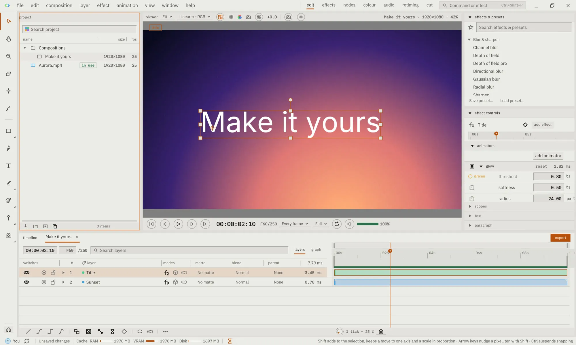
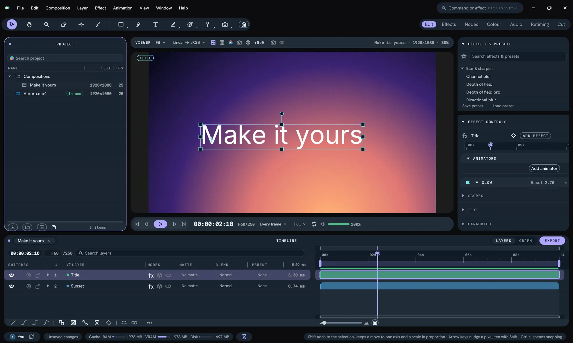
Label case overrides how a style cases its labels: All caps, First letter or Lower case.
A style of your own is a short file that changes corners, gaps, fonts, and how every part is dressed, glass included. See Make a theme. Reduce transparency draws a see-through style solid.
Move the bars
Section titled “Move the bars”Toolbar position puts the tools along the Top or down the Left. Viewer bars arranges the Viewer’s controls: Split, top and bottom, One bar, at the top, One bar, at the bottom, or Deck, which puts everything about playing in a fixed deck under the picture. Each can be left to the Style’s choice.
Words or icons
Section titled “Words or icons”Chrome labels decides what the bars say. Icons is the default. Words spells every button out, and Icons everywhere turns panel titles into icons too.

Icon set draws the icons Regular, Engraved or Bold.

Fancy drawing your own? Custom icons shows a folder. Put an SVG in it named after the
icon it replaces, such as razor.svg or pointer.svg, and come back to Lumit. The row
counts how many it replaced. See Make an icon set.
Size and spacing
Section titled “Size and spacing”- Scale runs from 75 % to 200 %.
- Compact tightens the row spacing throughout.
- Motion sets how much controls animate: Full, Minimal or None.
- Tooltips turns them on or off.
Wires, under Panels, sets how each wire in a node graph runs: Curved, Angled or Hanging.

Shortcuts
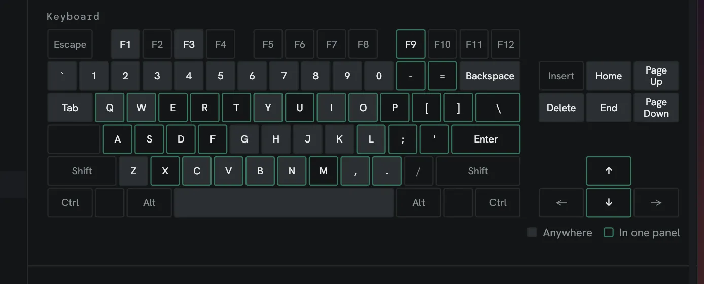
Section titled “Shortcuts”Settings ▸ Shortcuts lists every command. Click a shortcut to rebind it; a clash is flagged. Preset loads a whole keymap: Lumit’s own, After Effects or Vegas, and After Effects shortcuts ▸ Import… reads your own file from After Effects.
Arrange the panels
Section titled “Arrange the panels”Drag a panel’s tab to move it, and Window ▸ Workspace ▸ Save as new workspace… keeps the arrangement. See Workspaces and panels.
Take it with you
Section titled “Take it with you”Themes, keymaps and workspaces all export and import. With Lumit Pro, a signed-in profile carries all of it to your other machines.