
Make
Updated
Make a theme
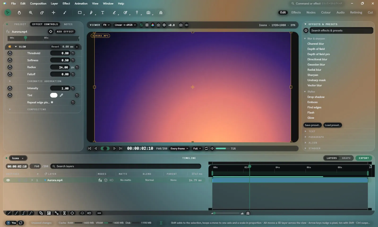
A theme is two small text files, each written like CSS. A colour scheme sets the colours. A style sets the shape: corners, gaps, fonts, and how each part of the interface is dressed. The two are chosen apart in Settings ▸ Appearance.
A colour scheme
Section titled “A colour scheme”@name "Harbour";@base nocturne-dark;
:root { --accent: #3fa7d6; --socket-number: #ffd166;}@nameis its name in the Colour scheme list. Without it, the file’s name is used.@baseis the built-in scheme it starts from, such asdark,lightorgruvbox-dark. A colour the file leaves out is the base’s.- Each
--name: #rrggbb;sets one colour.#rrggbbaasets its opacity as well, and a percentage after a colour scales it, as#000000 60%.
The file is a .lumtheme. Your themes ▸ Import… reads one and Export… writes the
colours in use as one, holding only those that differ from the base. A theme file written in
JSON by an older Lumit still opens.
The colours
Section titled “The colours”| Name | What it colours |
|---|---|
surface0 | Background |
surface1 | Panel |
surface2 | Raised |
surface3 | Control |
surface4 | Control hover |
timeline-out-of-range | The Timeline outside the work area |
selection-fill | A selected row |
room | What Lantern’s panels stand on |
text-primary, text-secondary, text-muted, text-disabled | Text |
hairline, hairline-strong | Lines |
accent, accent-hover | The accent |
animated | What is keyframed or being changed |
success, warning, error | Roles |
marker | Markers |
cache-disk | The cache bar, on disk |
waveform-rest, waveform-low, waveform-mid, waveform-high | The waveform and the multiwave’s bass, middle and treble |
curve0 to curve3 | Graph editor curves |
layer-footage, layer-sequence, layer-precomp, layer-solid, layer-text, layer-camera | Layer kinds |
viewer-surround | Round the picture in the Viewer |
socket-image, socket-number, socket-colour, socket-shape, socket-audio | Node graph sockets and wires, and their legend |
label1 to label9 | The label colours, in picker order |
The Viewer surround, the sockets and the label colours are not in the theme editor.
A style
Section titled “A style”/* Harbour: rounder and softer, with the Timeline set apart */@base lantern;
:root { --control-radius: 4; --card-radius: 20; --tile-gap: 14; --window-inset: 14; --sans: "Segoe UI";}
pane { background: var(--surface1) 85%; border: 1 #ffffff14; shadow: 0 8 24 #00000066; }timeline pane { background: var(--surface2); border: 1 var(--accent) 50%; }button { radius: round; }button:hover { background: var(--accent) 30%; }well { radius: 8; border: none; shadow: inset 0 1 3 #000000aa; }tab:on { background: var(--accent) 35%; }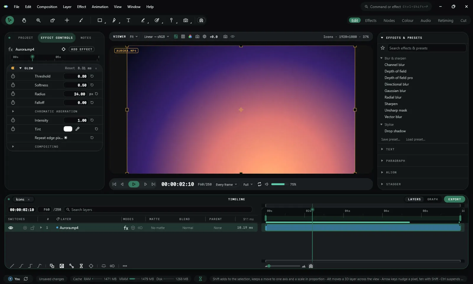
A style is a .lumstyle file in the styles folder, or in a folder of its own inside it
beside its pictures. Settings ▸ Appearance ▸ Your styles shows where the folder is:
%APPDATA%\lumit\styles on Windows and ~/.config/lumit/styles on macOS and Linux. Each
style is listed in Shape under the three built in. Lumit redraws when a style’s file is
saved.
@base is the built-in style it starts from: studio, desk or lantern. A line Lumit
cannot read is skipped, and Your styles shows the first, such as
Line 4: there's no setting called colr.
Variables
Section titled “Variables”:root sets the style’s variables. Every one is optional.
| Variable | What it sets |
|---|---|
--control-radius, --float-radius, --card-radius | Corners of controls, menus and panels |
--section-radius, --action-radius, --well-radius, --content-radius | Corners of sections, buttons, value boxes and layer bars |
--pill-inset | The gap between a pill and the fill inside it |
--tile-gap, --window-inset | The gap between panels and round the window |
--card-shadow | The shadow under Lantern’s panels |
--stroke-weight | The icons’ line weight |
--label-case | caps, lower or sentence |
--title-centred, --header-dot, --roomed, --tabular-numbers | true or false |
--sans, --mono | The two typefaces, by name, from those installed on the computer or bundled with Lumit |
--kicker-tracking | The spacing of panel labels |
--room | A colour, or a picture as url("room.jpg") |
--room-blur | How far a room picture is blurred |
--icons | A folder of icons, as url("icons"). See Make an icon set. |
A colour from the colour scheme, such as --accent or --surface1, set here replaces the
scheme’s while the style is in use. var(--name) reads any variable or colour.
A rule is a part, the properties to set on it, and optionally where and when:
part { property: value; }panel part:state { property: value; }| Part | What it is |
|---|---|
pane | A panel’s box |
header | A panel’s title line |
tab | A panel’s tab |
button | A button, including dropdowns and the menu bar’s names |
well | A value box or a text field |
menu | A menu or a dropdown list |
row | A row in a menu |
dialog | A dialogue, and the Settings window |
tooltip | A tooltip |
A name before the part limits the rule to inside it: timeline button dresses only the
Timeline’s buttons. The names are menu, dialog, menubar, toolbar and the panels:
project, viewer, timeline, effect-controls, effects-and-presets, scopes,
hierarchy, easing, graph, node, mixer, audio, audio-timeline, cut-timeline,
text, paragraph, expressions, stagger, notes, align and extension.
| State | When |
|---|---|
:hover | The pointer is over it |
:pressed | It is held down |
:on | It is the one in force: a fronted tab, a ticked button, a picked row |
:disabled | It can’t be pressed |
:focus | It has the keyboard |
:active | A panel that has the focus |
A button also takes .primary for the one filled action in a window and .dropdown for a
dropdown’s face.
| Property | Value |
|---|---|
background | A colour, or none |
border | A width and a colour, as 1 #ffffff22, or none |
border-colour | A colour |
radius | A number, or round for a capsule |
shadow | x y blur spread colour, with blur and spread optional. Several are separated by commas. inset casts one inwards. none takes them off. |
colour | Its words and icons |
blur | How far what is behind it is blurred |
Of two rules that set the same property, the one naming more wins: timeline button:hover
over button:hover over button. A state or .primary counts for more than a panel’s name,
so button:hover wins over timeline button. Of two that name as much, the later wins.
A see-through background with a blur frosts whatever is behind the part. Panels stand on
the room, and menus, dialogues and tooltips over the panels.
:root { --room: url("room.jpg"); --room-blur: 40; }pane { background: #ffffff 9%; blur: 28; border: 1 #ffffff2e; }menu { background: #1b1b1e 55%; blur: 30; radius: 16; shadow: 0 18 40 #00000080; }button { background: #17171a; radius: round; shadow: 0 3 8 #00000070, inset 0 1 0 #ffffff1a; }well { background: #0d0d0f 80%; border: none; shadow: inset 0 2 4 #000000b8; }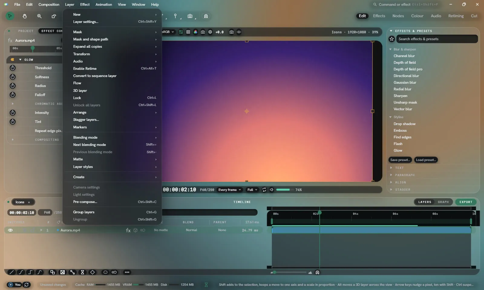
A blurred part’s shadow is drawn round it and never under it. Reduce transparency in Settings ▸ Appearance draws every part solid and blurs nothing.
Sharing
Section titled “Sharing”A colour scheme travels as its .lumtheme file, read by Your themes ▸ Import…. A style
travels as its .lumstyle file, or as its folder with its pictures and icons, put in the
styles folder.